The payment page design allows customers to submit payment and ordering information. The online checkout process will collect the customer’s delivery details, if applicable. Your website should be constantly optimized to improve speed, efficiency, and friction-free. Create a simple and efficient checkout system to increase sales, decrease customer abandonment and improve
conversion rates. The following article provides information on creating an attractive payment page for your business to increase revenue.
How to create the best payment page design?
A good user interface should be simple and help users navigate the site better. Here are some elements good website templates have in common.
1) Connect users to customer support
If your site has specific areas for customer support, please add customer support options on your payment page. Find a resource to assist customers whether it is information and support resources or a customer support website. You can correct this problem when the problem arises; you can also get receptive customers who will purchase. One solution is to trigger a chatbot when visitors are inactive so they can assist the user.
2) Display trust signals and badges
You should ensure that the payment page design displays prominent signs that customers feel safe during payment. Displaying this at the checkout makes the customer confident they can choose a secure platform. Customers should not feel the security of their information as their personal information can potentially be stolen.
3) Prioritize mobile-friendly design
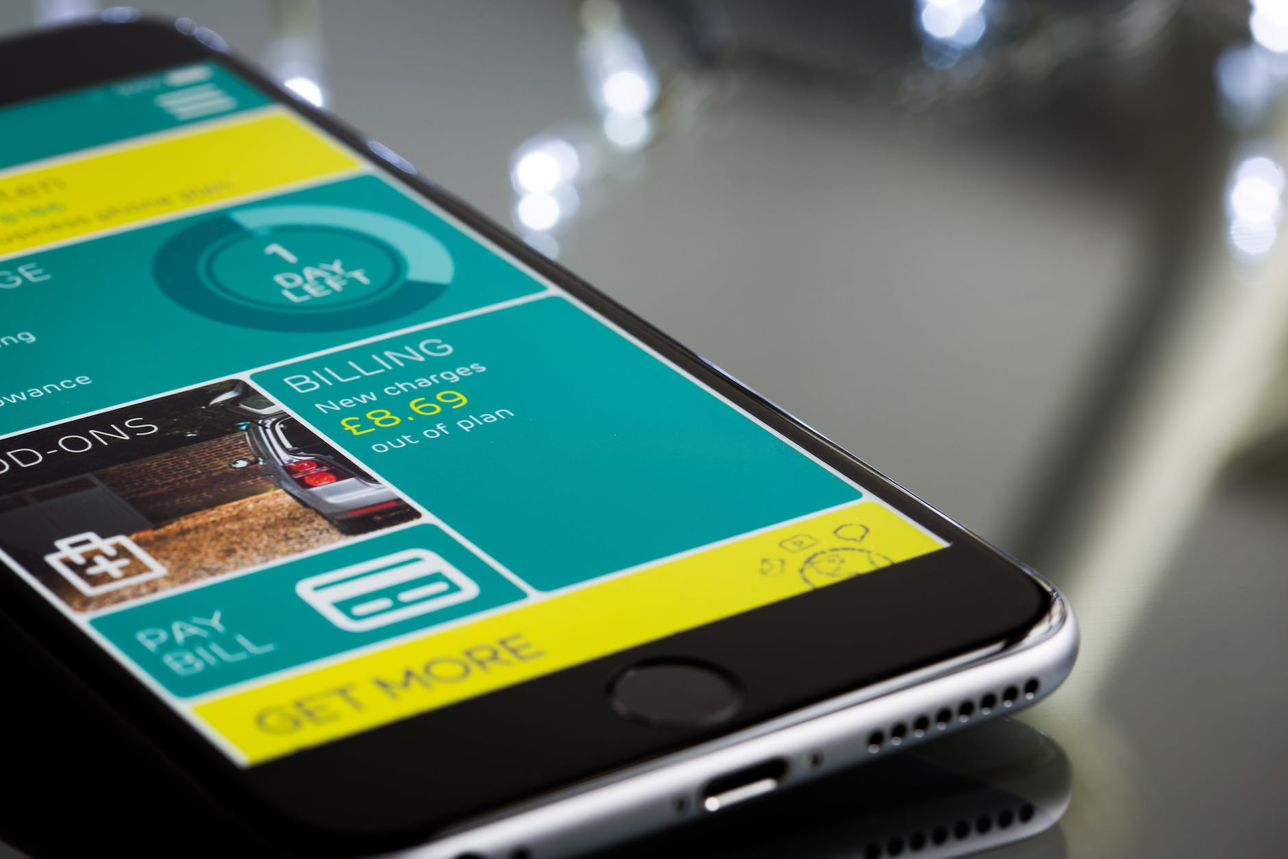
mobile-friendly design
The majority of online shoppers have mobile phones. Your payment page layout will reflect these changes. In designing a customer checkout, you have to consider ensuring the page runs smoothly and seamlessly across all device models. You must use contrast in color for different button buttons to improve the mobile user experience.
4) Minimize the clutter
You must make the checkout easy and clean with no unnecessary details or distractions. 25% of eCommerce shoppers have difficulty making a purchase because of lengthy checkouts. Obviously, the need for quick checkouts is critical.
5) Offer A Progress Indicator
Checkouts can take multiple steps. The customer must therefore move the orders multiple times before they are complete. You can add a progress indicator to your checkout page which shows exactly how many steps are taken by the client during the checkout process to get a refund.
How to optimize a payment page?
To increase sales and decrease failures of transactions, the payment site can be improved using multiple means such as:
Usability
Websites have axioms of usability that should be used to design websites. It is logical to apply these principles when designing checkout pages. In this case, the main investigation will focus on how many actions the user takes from the moment of the payment to its completeness. It is desirable to limit steps to the minimum and arrange all needed components in an order which
makes sense to humans. The customer has to know precisely what buttons must be clicked to complete the transaction. Next: inputs.
Financial security
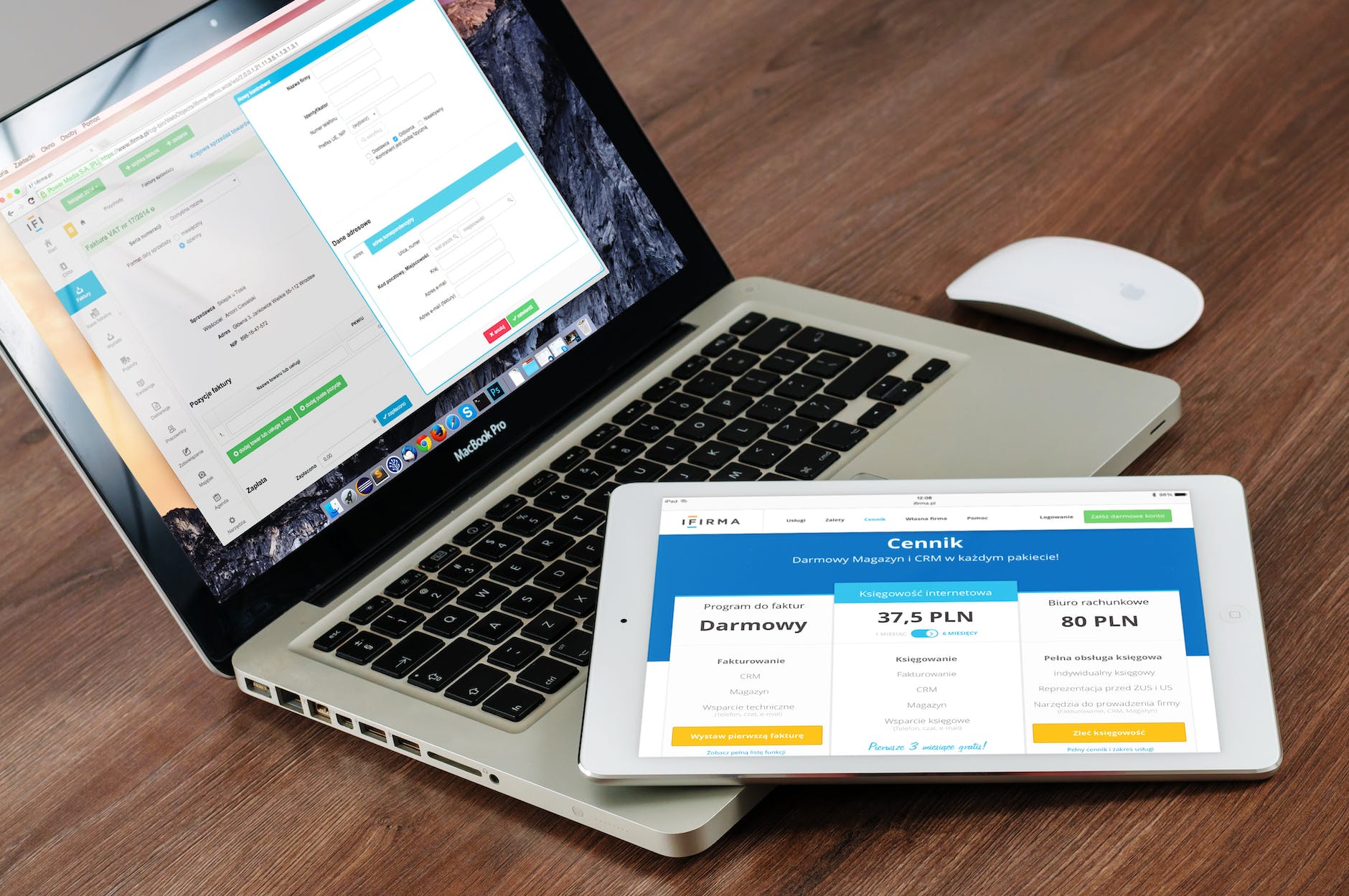
The form will be created separately for each payment method. User details have a high level of security to protect against unauthorized access and are encrypted using a TLS encryption protocol. Payment safety is guaranteed through the Payment Safety Industries Data Security Standard (PCI DSS). It should be necessary for the consumer to understand the security of the funds they have. The customer should always show that they have all the necessary information to make their purchase storage safe.
Square one
Square is available to assist with the online store setup for customers. Square has partnered to launch a new website development platform called Wix Weebly and GoDaddy. It will make selling your products easier. Square allows for API integration and allows for requesting payment through the Square app. It was created to reduce the time of storing online transactions, so you to track every single sale from one location. Advantages:
Amazon Pay
The payment with Amazon Pay will benefit both the user and the merchant who can make a purchase via the checkout page on their website. When you log in, you get an email with a buyer’s name. Adding online payment buttons via the Amazon Pay API is extremely simple, but Amazon has already released several instructional videos which help simplify it.
PayPro Global
PayPro Global is a payment processing company that provides various solutions for businesses to accept payments online. They offer several integration options, including plugins for popular eCommerce platforms and APIs for custom integrations.
Payproglobal.com allows you to customize the payment page to match the look and feel of your website. You can customize the page layout, add your logo, and choose a color scheme to create seamless user experiences.
Alipay
Alipay is a large payment service within the Alibaba Group. The major role will be utilized by the Group in acquiring products from Alibaba as well as settlements between others. Several financial institutions are also involved, including MasterCard, Visa, and many other international and regional financial institutions.
Additional marketing tools
Give customers an appropriate product on the checkout page. To order another piece simply tick the correct spot. The payment fee increases automatically. Clicking on payment activates more extensive financial transactions. Most of the time, it is a conscious decision to purchase something from the grocery store.
Conclusion
There are a few key things to consider when designing a payment page:
- Keep it simple: The payment page should be clean and easy to navigate, with clear labels and instructions for each process step. Avoid clutter and distractions that could confuse or frustrate users.
- Make it secure: Security is a top concern for users when providing their payment information online. Be sure to use a secure payment processing system and communicate this to users. This can include displaying security badges and seals, as well as providing clear information about your privacy and security policies.
- Optimize for mobile: Many users will access your payment page on a mobile device, so it’s important to ensure that the page is responsive and easy to use on smaller screens. This can include using larger buttons and easy-to-read fonts, as well as avoiding complex layouts that may be difficult to navigate on a mobile device.
- Use clear calls to action: The payment page should include clear and prominent calls to action, such as “Submit Payment” or “Complete Purchase,” to guide users through the process. These buttons should be placed in an easy-to-find location and stand out from the rest of the page.
- Test and refine: As with any design, it’s important to test your payment page to ensure that it’s effective and user-friendly. This can include usability testing with a small group of users, monitoring user behavior, and making improvements based on the feedback you receive.